
The days of staring at spreadsheets, trying to make sense of rows upon columns of numbers are over. (On this, I think we can all agree: thank goodness.)
As the ability to gather data from nearly every aspect of your business grows, organizations need to improve how they acquire, organize and ultimately analyze that data to make better decisions. Not all that long ago, only large enterprises had the resources — both technological and personnel — to harness the data and use Business Intelligence (BI) software. But today, the costs and skill sets for managing data are such that even a small company can visualize data to gain important insights.
Microsoft Power BI is a perfect example of this. Power BI offers a familiar and user friendly — yet still powerful — way to start visualizing your business data. With just a few clicks, you can create interactive reports, dashboards and other visualizations. Power BI even enables you to type queries in natural language, and handles files too large for Excel.
But the real value of BI tools like Power BI is how they help you create stories with your data. When used well, they let you find revealing answers about why something is happening in your business. Ultimately this helps you make more confident recommendations and decisions based on hard evidence, not gut feelings or experience. Chances are you already have the data somewhere. It’s just a matter of making the right correlations and form solid conclusions about what all those numbers mean. Visualizations help you see the forest for the trees.
This post will explore how you can start using Power BI to visualize data.
The Basics
Power BI has both a desktop component and an online cloud service. You use the desktop application to organize your data, combine data sources, add or delete columns, or reshape tables. You can create visualizations and reports on either the desktop or in the cloud. However, creating and sharing dashboards (as well as sharing reports) only happens via the cloud service. Power BI also offers mobile apps (iOS, Android, Windows) so you can view your reports and dashboards.
To get started, you need to provide a business email (it won’t accept non-commercial addresses like Gmail) and download the Windows-only desktop application. Power BI integrates with existing Microsoft Online credentials, which makes it even easier to manage if you’re already on Office 365.
Free vs. Pro Power BI
Fortunately, you can do a lot in Power BI for free, including clean and prepare data, analyze and build reports and publish them to the cloud service. There are a few reason that may convince you to sign up for a $120/year Pro service, from upgrading from 1 GB of data storage to 10GB and building interactive dashboards, to more automated data refreshes, higher streaming capability, and greater collaboration capabilities.
Nevertheless, the free version is a good way to dip your toe into data visualizations and become familiar with the products features.
Data Sources
Power BI boasts the ability to connect to and work with hundreds of different data sources, including Excel spreadsheets, on-premise data sources (ex. SQL databases), streaming data, or online cloud services (Google Analytics, among dozens of others). You can also pull data tables directly from some web pages.
Preparing Data
Once you connect to data or import it, you need to shape the data so it fits your purposes. The data will likely not have the correct names, or you need to reformat some text as numbers, delete certain columns, remove rows, etc. The process of shaping the data creates a query — a series of step-by-step instructions that the Power BI Query Editor carries out each time it connects to the data source in order to present it the way you need.
It’s important to note that the original data source is never affected — the query determines what this particular view of the data is, so that the data is always shaped the way you specify. This process occurs whenever you or anyone else uses this query in Power BI Desktop or in the Power BI service.
Those steps are all captured and recorded, in sequence, in a Query Settings pane, where they can also be removed or changed.
Combine Data
But that single data source might be only part of the answer that, with Power BI, you can combine with other data sources, either by merging it or appending it. You first go through the query process to shape the second data set appropriately, and then combine the two queries.
This is a powerful feature, because it allows you to confidently integrate data from separate sources that are nevertheless related — such as precipitation and store sales in specific locations over time — and then visualize how they correlate.
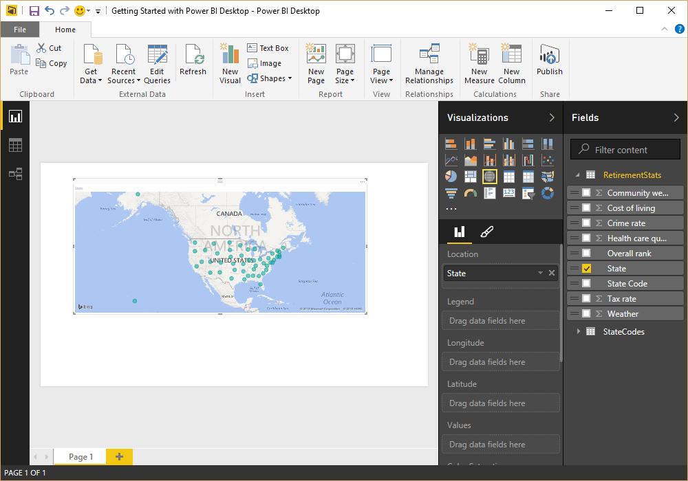
Build Reports
Here’s where you start to deliver meaningful insights. By dragging query elements and filters onto a blank canvas, you can quickly create and arrange visualizations of the data. For example, drag geolocation data onto the canvas and quickly create a map visualization. All of the visualizations are highly customizable, with different formats of graphs and charts, a full colour palette and themes. The canvas also has page tabs to generate a multi-page report.

Once the report is complete, you can either publish it to the Power BI service or upload the file directly, or save the .pbix file and share it like any other file.
Creating Dashboards
Of course, static reports are just the tip of the iceberg. With the report, you can generate a dashboard, a single-pane view of the most important visualizations that tell your story. In fact, a single dashboard can combine visualizations from multiple reports—and therefore multiple datasets. The viewer can then select a visualization to see the full report.
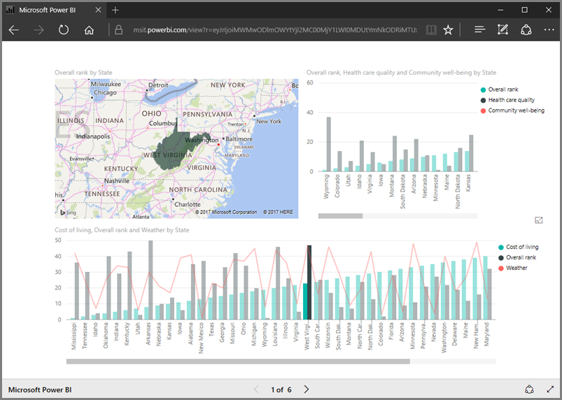
By extension, dashboards offer a consolidated view of visualizations based on many different sources of data that might otherwise be difficult to combine into a single dataset and report—for instance, on-premise and cloud data.
With dashboards, Power BI becomes more interactive and customizable, with visualizations that update as the underlying data changes. Dashboards are made up of tiles. If a viewer selects a tile, it opens up the report, an Excel online workbook, or some other data source.
Tiles can also be images or video. And if the viewer doesn’t like the look of a dashboard, they can resize, move and rename tiles. Viewers can even set up email notification alerts for when data achieves a certain threshold. You can also use natural language queries to ask dashboards questions. Clearly this takes visualizations way beyond a few charts in a PowerPoint deck.
Data-driven Decisions
Whether your organization has experience with data analytics or has never really attempted visualizations beyond simple Excel charts, Power BI is worth a look. It both simplifies how companies access and work with data, and makes it more dynamic. Microsoft also provides extensive online resources for Power BI that walk you through how to use the tool.
If you would like to become more familiar with Power BI, or need help shaping data queries to generate insightful reports and dashboards, we can help. Get in touch to learn more.